Industry
Financial Services
Client
Timeline
1 Month
Role
UX Research, Website Design
Clarity Over Complexity: Designing a Financial Website That Actually Builds Trust

When Your Website Looks Like Every Other Finance Brand, Nobody Stays
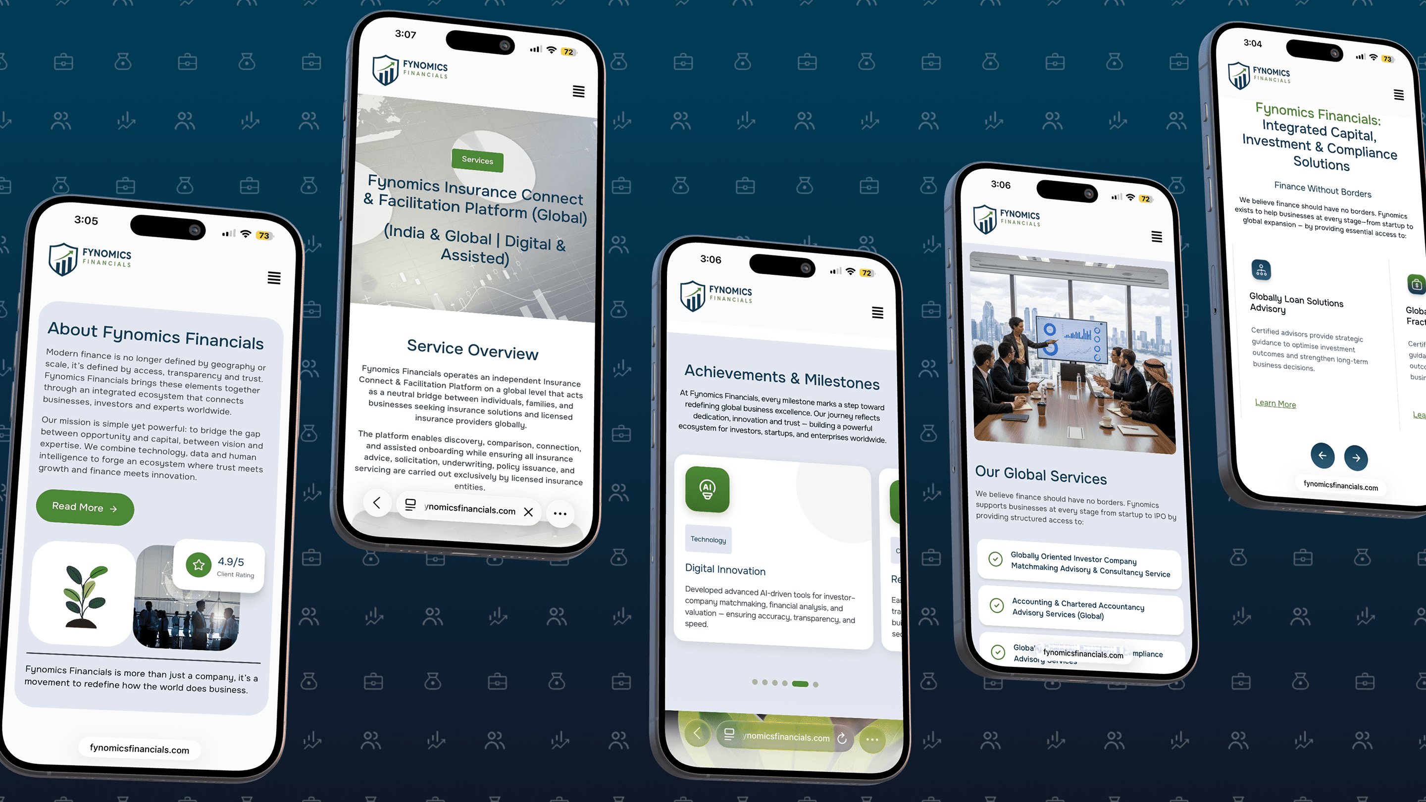
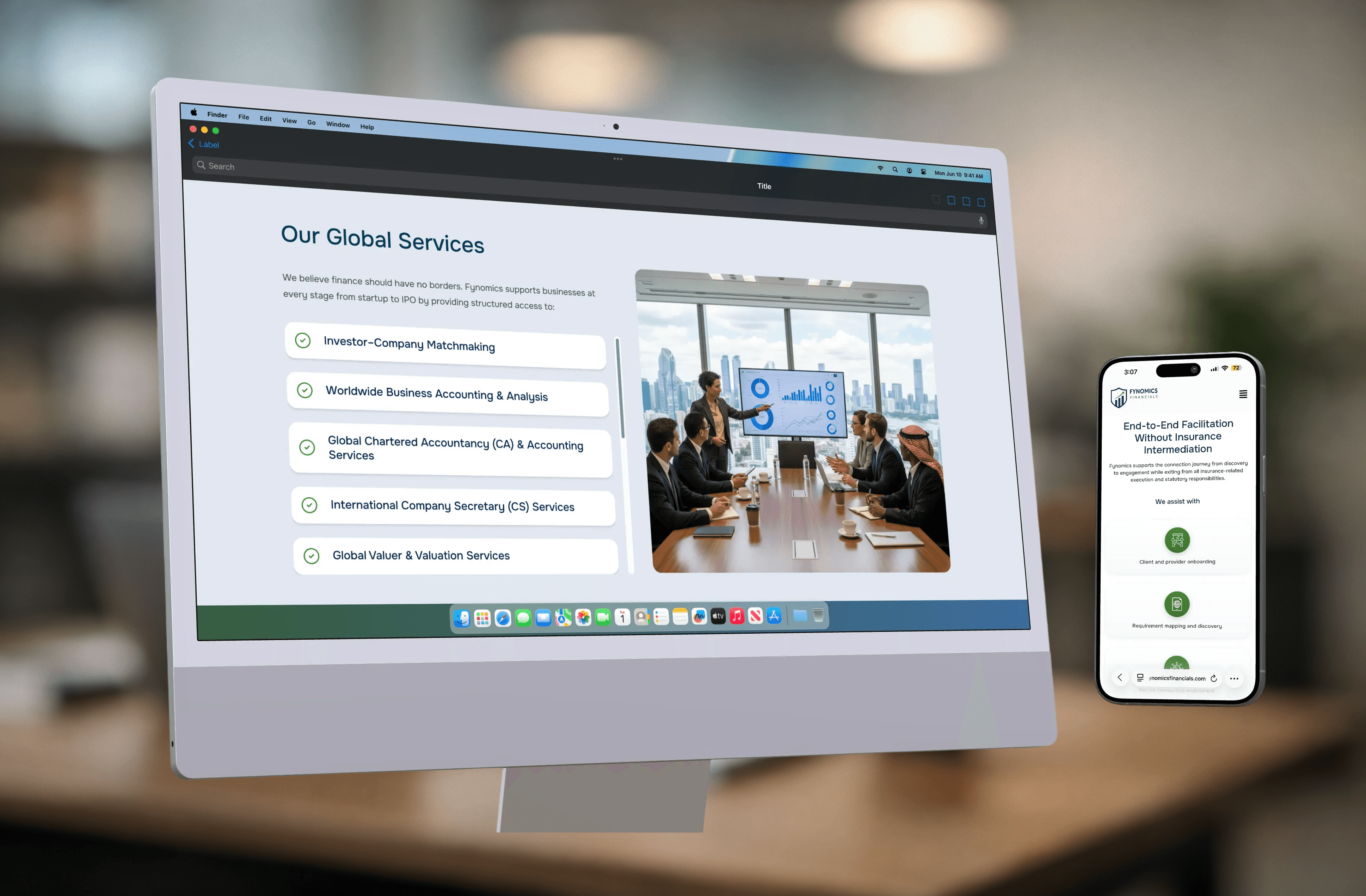
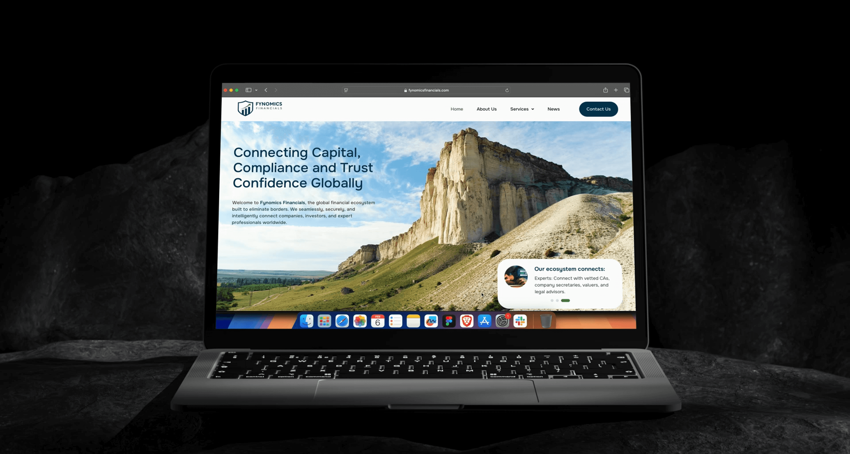
Fynomics Financials operates in a space where trust and clarity define success before a single conversation happens. Most financial websites fall into one of two traps — they either overwhelm visitors with jargon and dense content, or they go so generic that nothing sticks. Neither builds confidence. Neither converts. The goal was to design a platform that communicated professional credibility, financial expertise, and transparency without making users work for it. Research across competitors revealed a pattern of stock heavy visuals, weak calls to action, and poor content hierarchy that buried the most important information. That became the brief — build something cleaner, clearer, and more human than anything else in the space.
Features and Outcome
The design addressed every friction point identified in research. Content hierarchy was restructured so users could scan and understand services without reading dense paragraphs. Visual identity was built to feel distinct and credible rather than borrowing from the same generic finance aesthetic. Calls to action were placed with intention, mobile experience was prioritised from the start, and the overall system was built to scale as the business grows. The result was a website that improved brand visibility, sharpened service messaging, and gave Fynomics a digital presence strong enough to hold attention and build loyalty.
Every Project has a story