Industry
Fintech
Client
Timeline
Nov - Dec 2025
Role
Lead Product Designer User Researcher
Financial Matchmaking & Advisory Portal
Designing Trust at Scale: A UX System for Smarter Financial Decision Making
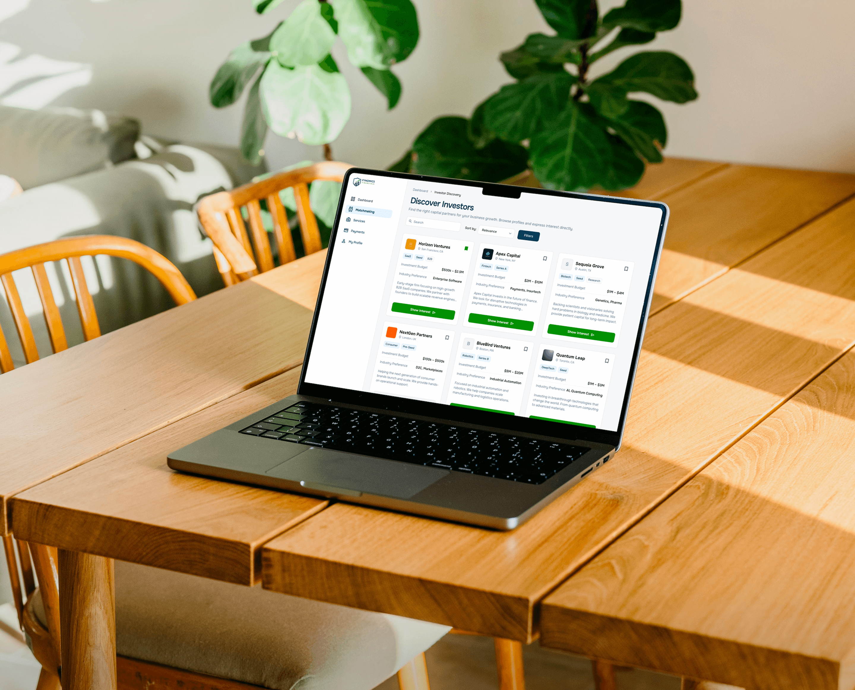
Fynomics is a financial matchmaking and advisory portal built for a three sided ecosystem of individual investors, financial advisors, and platform administrators. The core challenge was never just visual. It was structural. How do you design a platform where high stakes financial decisions feel approachable, where compliance does not kill clarity, and where three very different user types each feel like the product was made for them? The answer came through a gated, role based design system built on a foundation of trust signals and intentional information hierarchy. Every screen was designed to reduce cognitive load at the moments that mattered most during onboarding, matchmaking, and portfolio review. The visual identity of Deep Navy and Emerald Green with the Onest typeface was a deliberate choice to communicate credibility without coldness.


Key features and Outcome
The platform was structured around three distinct dashboards, each tailored to a different user type while sharing a consistent design language. Investors got a clean matchmaking interface with filtered advisor discovery. Advisors received a portfolio and client management workspace. Admins had a backend built for oversight and compliance control. A compliance first gated access system ensured the right people saw the right information at the right time, without the experience feeling restrictive. The final product demonstrated how a complex, regulation aware financial platform could still feel intuitive and trustworthy at every touchpoint. The three tier system proved that designing for multiple user roles does not mean compromising on clarity. It means building a smarter structure underneath so each user only ever sees what they need.


Every Project has a story